As you read this, the dust will have settled on another Australian Open. Glittering trophies will have been held aloft and a million paparazzi photos will be flying through around the globe, celebrating the latest grand slam winners.
On the court, it’s black and white who wins and loses. But off the court, in the sponsorship race for brand love, winners and losers can be a little harder to separate, a little more open to interpretation. Regardless, here’s my take on the highlights and lowlights of the Experiential Brand Slam.
Gemba’s Marketing and Comms team took a walk through the carnival that is Melbourne Park during January, and it’s not a stroll for the faint hearted. Firstly, it’s massive, and often blisteringly hot. From Federation Square in the heart of Melbourne’s CBD, right through to the back courts in the shadows of the MCG, the AO precinct is big, bold and busy. There’s never a dull moment and always something to do.
The experience is highly curated and slickly executed, with smart spaces segmented by audience, merging together to produce a smoothly functioning organism, teeming with fans of all shapes and sizes, ages and attitudes. Whether you’re there to party, rub shoulders with celebs, entertain the kids, get free stuff, or even watch some tennis, the AO precinct makes it all very easy. And the fans are up for it. The unique scheduling of tennis and the ground pass ticketing option means that fans have serious dwell time; time to relax and soak up the atmosphere, time to stop and listen to what a brand has to say.
And in amongst the vast, colourful grounds, the AO’s sponsor partners are seamlessly integrated into the experiences. So which brand did it best? He’s a snapshot of some of the more memorable activations.
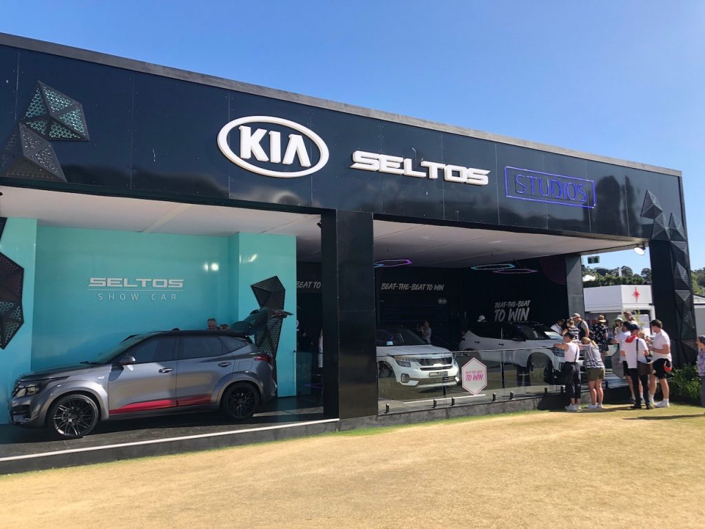
As a major partner since 2002, the KIA knows how this event ticks and this year, they activated in style. We spotted at least three major Kia displays/activations. More than passive vehicle displays, fans are given the chance to get up close and personal not only with the latest models, but also their incredibly popular ambassador, Rafa Nadal.
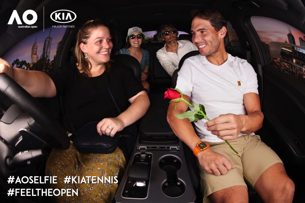
Impressive scale and slick execution. From the the Billie Eilish pumping soundtrack to the Rafa voiced instructional videos on the in-car display, it was hard not to like the ride. Nothing groundbreaking, but good solid tech (interactive team based dance game) great design and smooth user journey. They gathered data, showed off vehicle specs and styling, but managed to keep it fun and fresh. Fans dancing behind your SUV, using the on-board display and sharing selfies with your campaign graphics? It’s a win-win. (They didn’t need to give away the land-fill wrist bands, but that was the only real negative.)
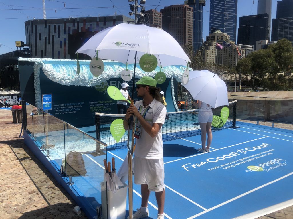
On the sustainability angle, Garnier made a big play this year about recycling plastic waste from the oceans, turning trash into competition tennis nets. It was a way of showcasing and giving away some cosmetic new products made with more sustainable plastic packaging. Fans got a photo on the wave in exchange for a free hat or some samples. (It was a little hard to reconcile sampling thousands of small plastic containers with the theme of sustainability, as well and wonder where the giant wave prop would end up at the end of the two weeks. Let’s hope it’s biodegradable or recyclable!)
Kids and family brands activated in designated kids’ activity areas with a mix of physical, digital and sampling activities. Emirates boasted an impressive flying fox. Natural Confectionery Company cooled things down in a water pistol theme park. Heinz sampled some new sauces in a funky family gazebo while Disney+ rolled out big-franchise photo-op props, plus some QR code led digital immersion.
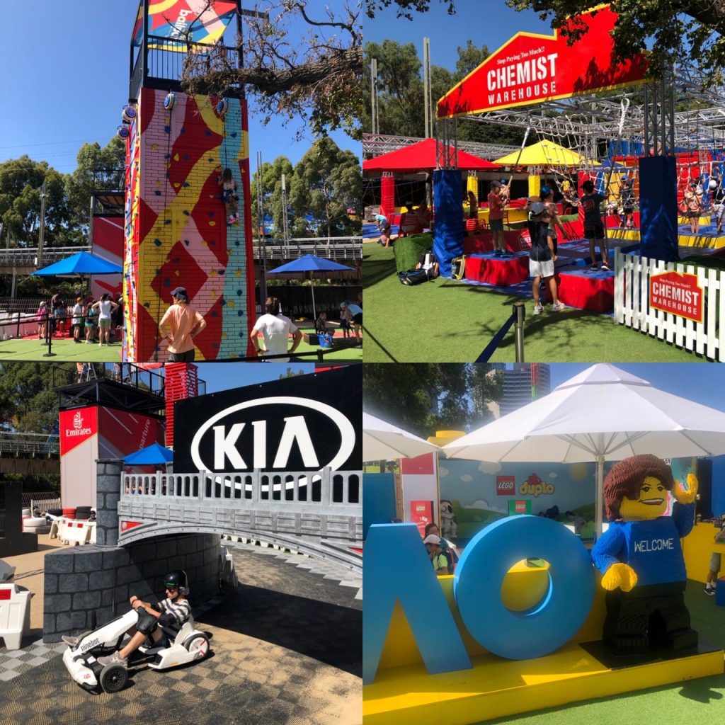
And because shopping is a passion that can’t be neglected for more than a few hours, the precinct does a great job of offering brands the chance to sell their product at numerous, well appointed outlets.
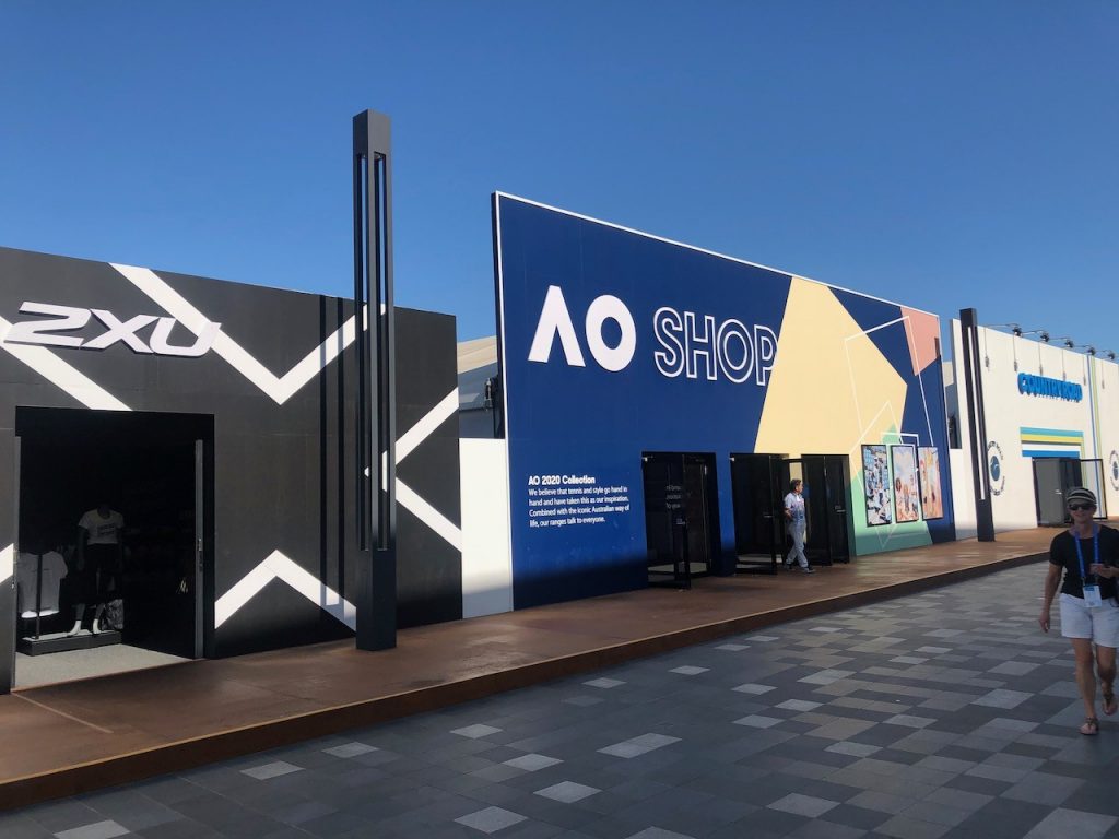
Adidas, 2XU and Country Road both had major retail footprints, the latter offing some slick and seemingly popular product personalisation. Buy an AO branded CR hoodie or tee and get your national flag/fave player’s name embroidered on it free. A pop-up Chemist Warehouse was doing a roaring trade in supplements, sunscreen and headache remedies in their slick retail space.
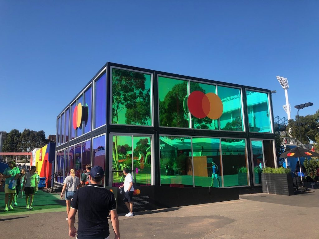
Mastercard’s offering looked mighty impressive alongside the garish retail colours of Chemist Warehouse. Picture a two-story minimalist glass box, reflecting brand colours down onto fans queuing for a taste of high-tech brand immersion. A panic room themed experience, educating guests about Mastercard’s encryption technology offered probably the only genuine innovation on site. (Long wait times and an early closing meant that yours truly did not get to experience it, so I’ll have to take the PR’s word for it and tell you it was a great success.)
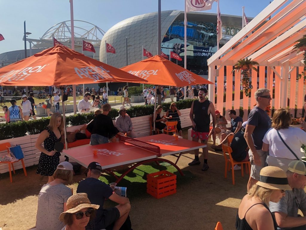
The food and beverage offering on site is pretty astounding. Expensive, yes, but polished and omnipresent. There was nowhere on this enormous site (apart from the kid’s zone, perhaps) where you would find yourself more than 15 metres from an ice cold beer/wine/cider/coffee/Aperol Spritz. The booze brands, in cahoots with the precinct curators, did a great job of building a genuine festival atmosphere of sport, music and culture.
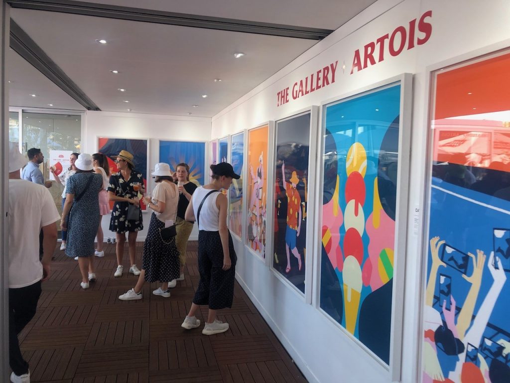
A personal fave activation for me and the Gemba crew was The Gallery Artois, unveiling new, freshly created original artwork everyday of the tournament. International artists worked on site, creating original and highly desirable artworks that were put on display daily in the gallery. 300 smaller, limited edition prints were given away of each print, and I was lucky enough to be in the right place at the right time to score one. This is certainly the only ‘envy-inducing’ freebie we scored, dragging us back to the bar again and again. (The original posters are to be sold via an online auction, and all proceeds to bushfire relief. Nice touch.)
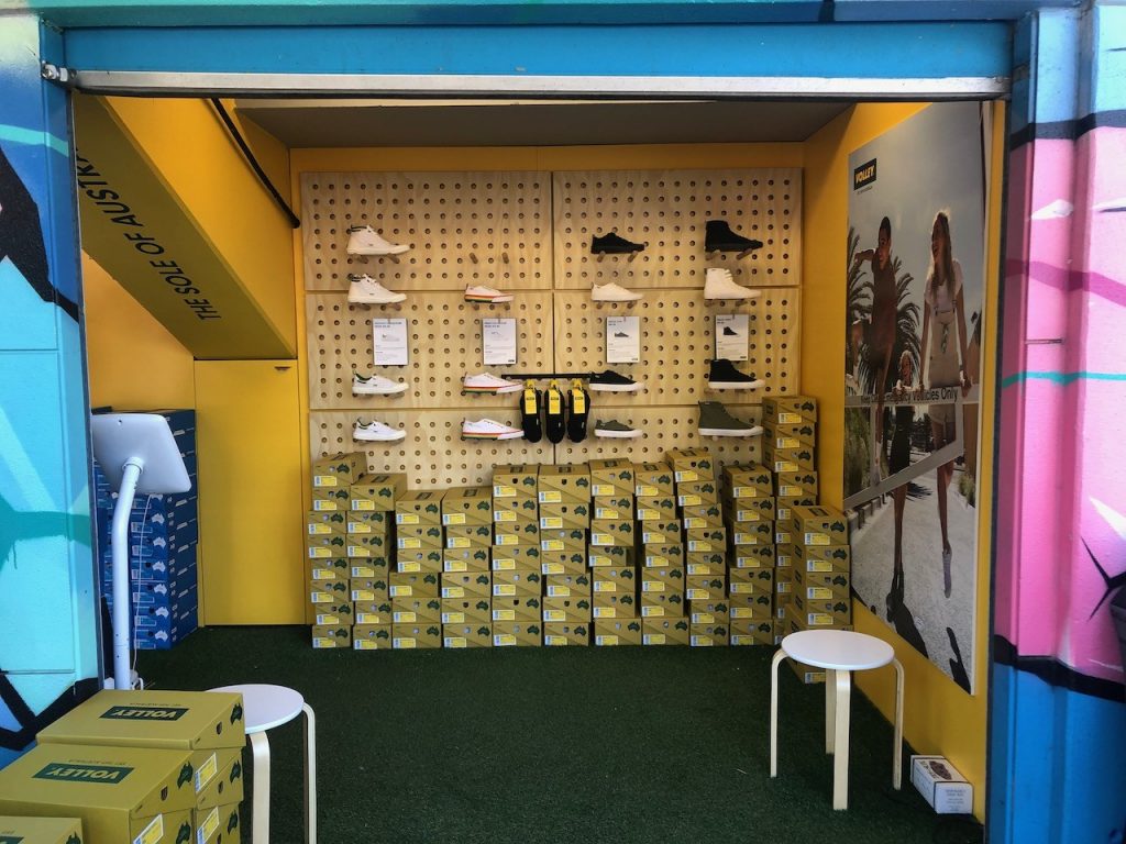
As well as the big brands delivering large scale activations, there were some smaller players sprinkled around the precinct. There was the ubiquitous, slightly glitchy VR tennis game, countess photo/video booths, and even some micro retail – special mention to the Dunlop Volleys store, tucked away cooly in the shade alongside Garden Square.
On the other side of the precinct, you can find the more exclusive brand hospitality installations. VIPs dine at pop-up Nobu or Rockpool, before a short red carpet walk to be court-side at Rod Laver Arena. Post game, they’ll be whisked away to an intimate, invite-only gin-bar overlooking the glittering Melbourne skyline, while sipping a negroni and listening to live jazz. It’s the best of Melbourne summer, crammed into the one gated event.
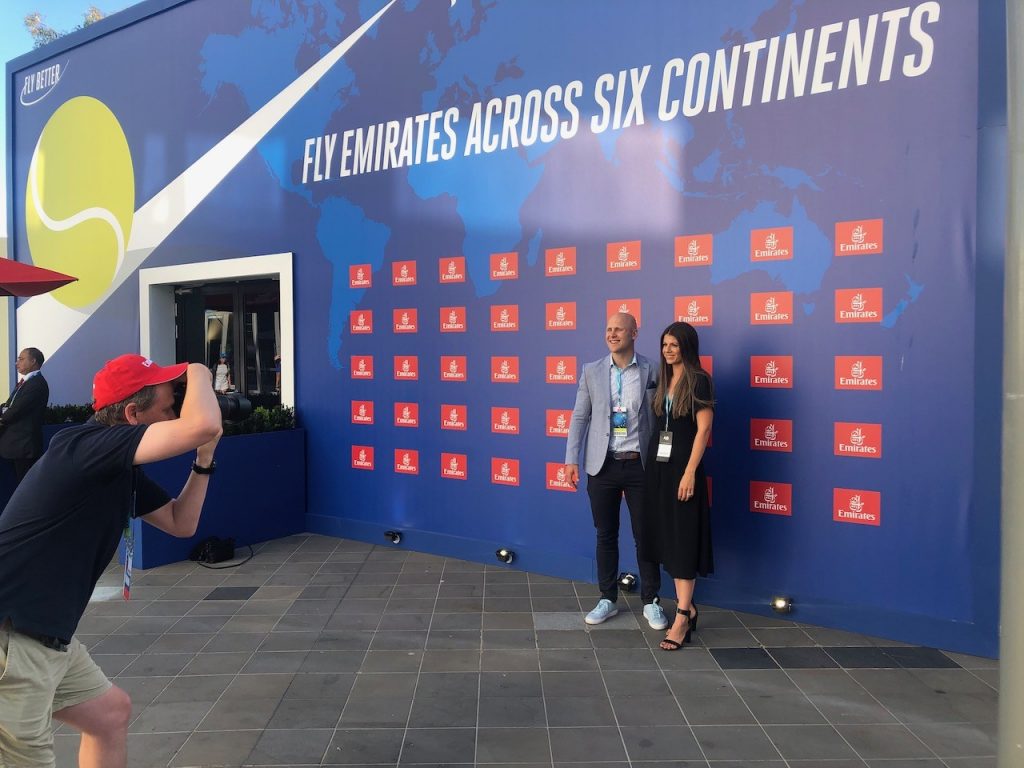
Overall, it’s probably the slickest sporting/brand integration in the country. Two weeks is long enough to invest in serious infrastructure and tech. The same venue year after year means learnings get captured and tweaks get made, and fans understand how to get involved. Hundreds of thousands of festival goers embrace the full experience, not just turn up to a match and then go home.